


It Might Get Loud
All I do nowadays is watch documentaries
On Wednesday we were given a new motion graphics brief based around learning Adobe After Effects which is all rather exciting.
We've been asked to source a piece of spoken word audio between 10-20 seconds in length that we find 'inspiring'. Initially we were supposed to use interviews with creative practitioners, graphic designers we find inspiring etc but over the course of the briefing it seemed to transform into anyone we were creatively inspired by whether they are a designer, painter, sculptor or musician.
Once we have our audio we are then to animate the words spoken within the interview in After Effects, what we'll be creating is kinetic typography. We had a great presentation from our tutor Pete who always seems to inspire me in some way with his examples of previous work. These I won't share with you but I am already thinking about the possible mixtures of analog and digital media for this project.
I spent pretty much all of yesterday watching my favourite things, documentaries, about my second favourite thing, guitars (and their players). The video above is the trailer for a film titled 'It Might Get Loud' featuring Jimmy Page, Jack White and The Edge. I'd urge everyone to watch it, even if you're not into guitars and stuff as much as I am. It's really interesting to hear how 3 of the best known guitarists ever talk about their very different styles, techniques and approaches to playing what is in essence is the same plank of wood with 6 strings stretched over it.
We all know that we love and are inspired by graphic design, I feel like I don't need to reiterate it. After all we are on a GRAPHIC DESIGN COURSE. The thing that inspires me more than anything is listening, watching and playing music (remember the passionate presentation) hence that is what I will be basing this project around. Personal is powerful.
F.I.T. New York

So yeah about a week late, I will be going to New York and studying at the Fashion Institute of Technology for the first term of my second year, around 4 and a half months from August to December.
Excited is not even the word.
Thanks again to everyone who helped with the video.
How To Set Up Your Own Pirate Radio Station

Above is my final outcome for the 'Do This Brief' project. A not very concise guide on how to set up a pirate radio station. Overall I am really happy with the way this has turned out, the whole subculture, DIY aesthetic is exactly what I was aiming for and the tone of the piece again is spot on. I was trying to get it so that you could photocopy this and mass distribute it easily if required. I spent a lot of time researching pirate radio trying to break it down to just the essentials which was really fun though quite complex at times. Marrying the information with how I wanted the illustration to turn out was a bit of a challenge as well but again I am super happy with it all. The whole idea of this project was to learn Adobe Illustrator though which although I was fairly familiar with anyway, spending more time with it really allowed me to fully get to grips with the specifics and shortcuts of it and I am now full competent. CLICK THE PICTURE FOR A BIGGER VERSION.
Illustrate-her

Since I have now handed in my New York piece I have been able to concentrate my efforts on some of my other projects which are currently on the go.
Now working on a "How to..." project which is based around learning Adobe Illustrator. We were asked to produce a range of instructions, guides and plans to clearly communicate a range of events and activities that will enable people to survive and thrive in times of austerity.
We were kept in our mail art groups and each group was given a 'life theme' to take inspiration from. Our theme was communication which was a challenge to initially brainstorm but once we had completed a full workshop day in class with everyone donating ideas to each other's themes we were getting into the swing of things. A lot of people are focusing on trying to save money but cutting down on things within their various 'how to' guides, however I wanted to try and be proactive, setting up something creative for as little money as possible seemed like a great concept to start with, especially something that you can communicate with.
So with this concept in tow, I came up with the idea of:
'How to set up your own pirate radio station'
Pretty psyched to really get my teeth into it now. I have a basic idea of what I want to do. Now the tough bit is going to be researching it and finding out exactly what I want to do with and where I want to go with it. After a few hours of note taking, book reading and googling I came across this awesome trailer for a documentary film called "Drowned City" about London Pirate radio stations and the people who run them. I'll leave you with the trailer for now whilst I go stare at a computer screen for hours on end.
Trans-Atlantic

Tomorrow is the hand in for our New York project.
The edited film will appear here immediately after.
I have spent the last 2 weeks filming and editing.
All other projects have been sidelined for now.
Very excited to show everyone the film.
Regardless of whether or not I get to go.
I am so happy I made it
and how it turned out.
So yeah.
Tomorrow.
Good luck
everyone.
Submarine

This afternoon at Chelsea we were given a lecture by a lovely illustrator who's name is Nina Chakrabarti.
About half way through her talk she showed us this piece of her work which happens to be the illustrations for one of my favourite novels ever. The novel in question is called 'Submarine' by Joe Dunthorne. I first encountered Joe last summer in the poetry arena at Latitude Festival where I spent some considerable listening to him and his band of troubadour poets. I bought his faber booklet there and since then have been really inspired by his poetry and his DIY ethos (he puts on a poetry night called Homework which runs every first wednesday of the month at the working men's club in Bethnal Green).http://www.aisle16.co.uk/homework-ldn/
Submarine is Joe's first novel and one of my all time favourites since reading it last summer. Last year I learnt that the book had been taken up by I.T. crowd star and Arctic Monkey Video music director Richard Ayoade and was being made into a film. Well that film is now finished and is being released very soon in the UK after taking worldwide film festivals by storm. I have been a massive fan of Ayoade for years after he directed the Arctic Monkeys DVD Live at the Apollo and their more recent music videos. Alex Turner has even completed a 6 track EP for the film's music.

It's weird how cyclical this whole affair has been, I think that the film has the potential to be the British cinema hit of the year but then the equal potential become an indie film classic, unrecognised by the masses who are used to hollywood blockbusters and rom-coms churned out by the apparent same 10 or so actors and actresses, YES Jennifer Anniston and Paul Rudd I am looking at you!
Below is the trailer for Submarine and you can make of it what you wish...
NEW WORK

So yesterday we given a talk by three second year students about an opportunity we have as Graphic Design students at Chelsea to compete for the chance to win a place on a semester long exchange with F.I.T. (fashion institute of technology) in New York.
The brief in short is that we have to create a piece of work that expresses why we want to go to NY and the lengths we would be willing to go to to get there. Responses can be any media and size so literally anything goes. However they suggested that we use famous New York icons like the statue of liberty, the street layout, pretzels, yellow taxis etc as our inspiration. Really excited about this project, despite the potential amount of money it could cost nothing could compare the experiences we could have there. Pretty much the same project as last year, one girl got a tattoo of a dollar sign on the sole of her foot and said she'd 'put her heart and soul' into the trip and won a place. HOW AWESOME IS THAT?!
Milton Glaser designed the logo above, quite possibly one of the greatest logos of all time.
I will be making a video in response to this brief. That is all.
MALE ART

Moving swiftly on, last Thursday we were given a new project based around the concept of 'Mail Art'.
I stupidly missed the briefing for this project which was a massive error as we got to choose our own groups for once but luckily Mr Harry Holt and Johnny Holmes claimed me and Ben for our group. Here's some stolen blurb from Miriam's blog as like I said I missed the briefing...
To give an overview- 'Mail Art' is a movement which began in the early 1960's in which networks were formed and would use the postal system as means of communication to exchange art as well as to collaborate with others on projects.
This has been given to us as a starting point and in our groups, we may create a project of our choice that in roughly three weeks time we can present to the class in analogue form. RAD THANKS MIRIAM.
This has been given to us as a starting point and in our groups, we may create a project of our choice that in roughly three weeks time we can present to the class in analogue form. RAD THANKS MIRIAM.
This project has come at an interesting time as my laptop has just decided to break itself. Currently in a state of flux where using analog is the only option at the moment for me and so doing a 'Mail Art' project seems incredibly apt at the moment and I am throwing myself into this project head on. Really excited about our idea but it needs an awful lot of work to make it happen. Myself and Holmes spent this morning in a Bethnal Green model shop with some nice little Chinese ladies and a laser cutter.
More to follow shortly.

You Utter Dingbat!

A quick overview of the first project we have been given since our return from Christmas break. We were put into groups of 3 and told to produce a 20 second long stop motion animation based around the typeface Zapf Dingbats (shown above). By based around, I mean we were only allowed to use the Dingbat characters only changed in colour and scale. The animation was to be produced on a flat 2D surface out of paper/card and shot using istopmotion, a pretty nifty little stop-motion programme we were provided with in a slot of 2 hours. All editing was to be done in shot so for zooms etc we had to produce a number of the same element in different sizes which was quite time consuming but the week before we had an awesome storyboarding workshop to help us out with pre-planning and spent a good amount of time storyboarding our own animation and creating the character and elements in illustrator. Nothing was left to chance.
I was with Sunnie and Chloe which was lucky as they are as sick and twisted as I am apparently and loved my initial idea of animating a Dingbats Peepshow based around the early animation machines we were shown as part of the introduction to the project. Once you start looking it becomes very apparent that Dingbats is full of absolute filth and our animation can be summed up by one word, TASSLES! We had a good week to prepare our animation which was lucky as Chloe was stuck in the USA until last Tuesday but managed to get it all done for yesterday which was our alloted time. The final animation has yet to be exported in its full glory but hopefully we'll be able to get our hands on it and I'll post it up here. There might even be some kind of Dingbats showreel using clips from the other groups in our class. I am super happy with the way it came out, it is almost exactly the way I imagined it, if not better. Props to Sunnie and Chloe as well for putting up with me being so immature and working so well together, very good start to the year. We definitely bonded over burlesque, tassle technique and "Lacie" as she will be forever known.
Below, a few pictures of yesterday. Animating and being silly.


Bad Type's Bad Day Out
On the 14th of January 2011 myself and my class mates took our Bad Type white letters for a Bad Day out around Chelsea and Pimlico. Above is a video I made of that day using my new Cannon 550D camera. Having never used it for video I thought this would be the perfect opportunity to test it out and have a go at editing in Final Cut Pro for the first time as well. I am pretty happy with the results although I'd like the shots to be less shakey although I guess that comes from practice (maybe even investing in a tripod?). Editing wise I could have done a lot more but again with practice and patience. Below are some photos of preparation and the day itself...enjoy


Shrinally...

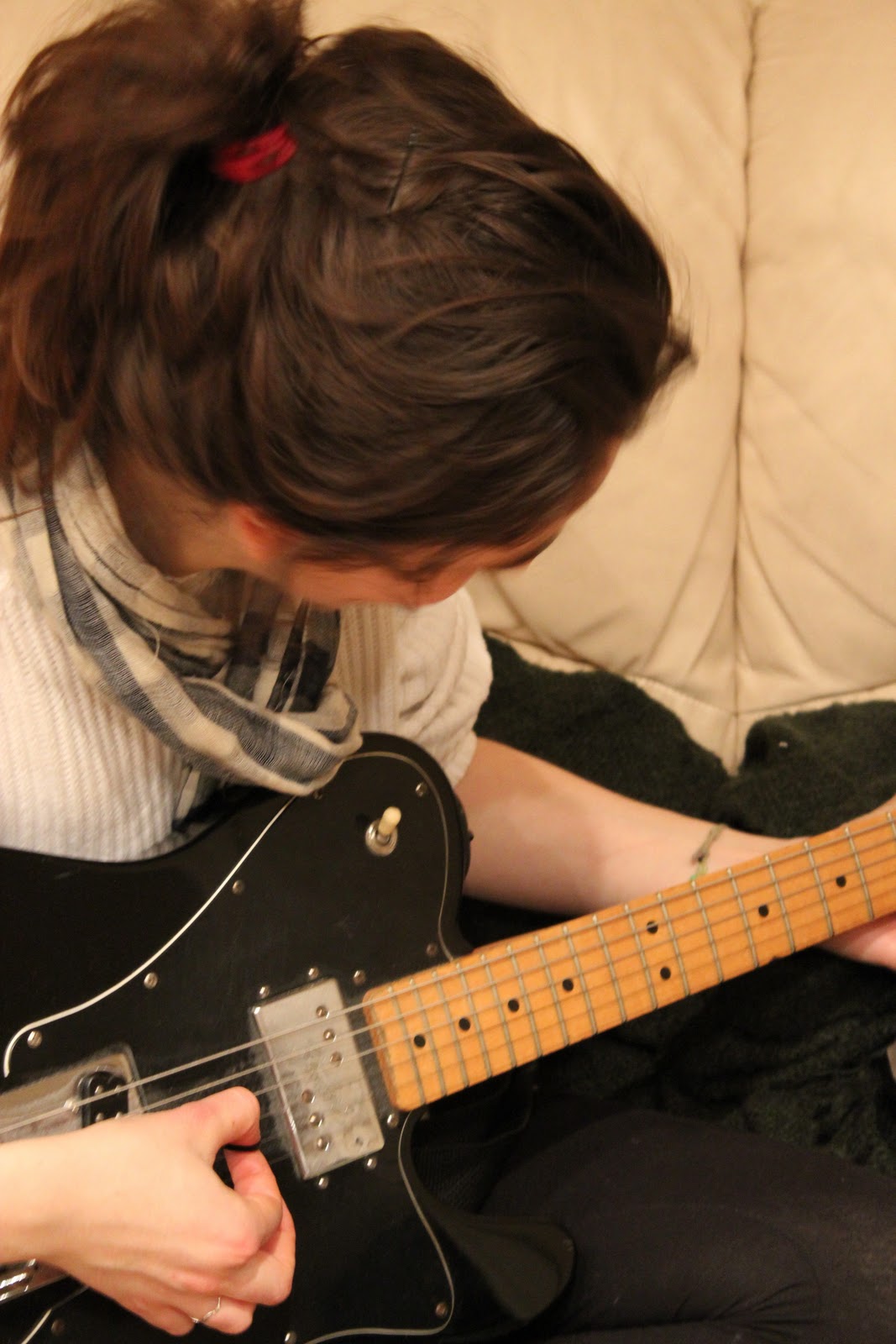
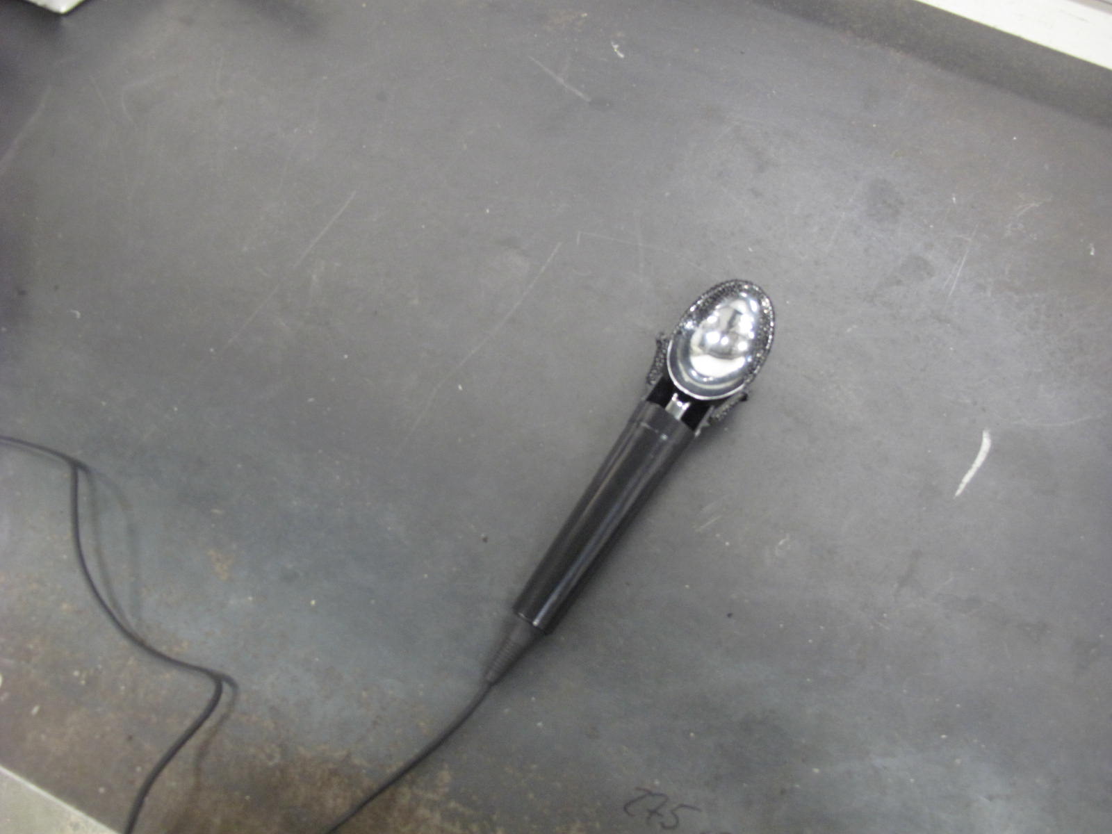
Above is the final image for mine and Rachel's shrine project where we had to combine our passions of playing live music (Me) and ice cream (Rachel). Shot in Thamesmead on a very cold evening at the base of Honours Ice Cream who me and Rach. got in contact with and visited twice over the course of this project. This was probably the longest project we were given over term one though only reflected in one photograph, many hard hours of work went into this running round trying to hire/buy smoke machines and industrial lights as well as going to and forth to Thamesmead twice. Huge thanks to Onur for being so welcoming and enthusiastic with us, massive props to Rachel as well for being an awesome partner to work with. Both linked above. Below a few images from our working process with involved making home made ice cream, teaching Rachel how to play 'Seven Nation Army' on guitar, visiting Onur the first time and combining a microphone with an ice cream scoop (more photos to follow of that).




Wes Andersonism

Manifesto 2 of 2.
For our second manifesto we were allowed to choose any subject whatsoever, write and then typographically represent a manifesto on that subject. I chose to write a manifesto based around my favourite film director Wes Anderson.
A slap in the face of public taste

Manifesto 1 of 2.
Above is the first of two manifestos I have designed. The brief was for the first manifesto to be based around an arts/design movement from 1890 to 1930. I chose the largely unknown Russian Literary Futurist manifesto 'A Slap in the Face of Public Taste' purely for the title and the fact it is so unknown.


when life gives you lemons, make...

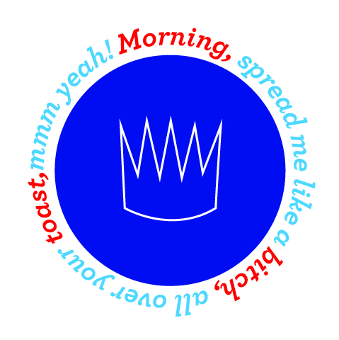
Ok so, in addition to the numerous and wonderful presents I have already bought my family for christmas this year I decided to make a batch of lemon and lime marmalade as a sort of nice homemade thing that everyone can enjoy. The ingredients are pretty simple but the process itself is somewhat more complex and time consuming. Don't attempt if you have any sort of cuts on your hands, citrus and open wounds do not mix well. I got the recipe from my housemates Leon cookbook if anyones interested in making some of their own. As well as making the marmalade I have designed labels for the jars which hopefully I will be printing tomorrow and will post here once they are all done and photo'ed. I have designed the labels around the idea of myself starting up a jam making company called king of preserves. and am super happy with the results, the jam tastes alright too which is good news.


Golden Boy

Above is the final outcome for our iconic photo project where we had to choose and recreate an iconic photo with the only condition being that it had to be 'properly iconic' and not just a photo of a modern day celebrity. We had to organise all props, clothes etc ourselves then each student had a group session in the photography studio with the awesome Alex Madjitey. Basically a short introduction to the photographic facilities, each student would shoot another's photo while Alex would sort out lighting etc. I actually made it to the studio 3 times no less to complete shoot for this photo but it was totally worth it with Alex now referring to me as exclusively 'golden balls'. YES I did actually paint myself Gold.
Props to Alex for his awesome lighting and general photography skills, Paige Shaw for shooting my golden boy photo, Vanille VDC for shooting the suited photo and Julia Salotti for being my Bond girl.
Below is the original film poster which I based my shot on. I spent hours trying to find the right weight of Gothic to match the fonts exactly but to no avail.


SNOW


DISCLAIMER: The white powder you see in the images above is icing sugar NOT cocaine or any other illegal narcotics.
Ok so now that's done with time to explain. Above, for the most part is the final set of images for one half of the Destroying Bad Typography brief. The brief states we must make our allotted letter (mine is capital E in Times New Roman if you're in any doubt by now) in using two different materials. The first material was wood which each person has to use by way of an induction to the workshop which I posted a few weeks ago. The second material is completely up to each individual person and is where this project really comes into it's own, the only rule for both letters is that it must be white and that you must destroy it yourself. Below is a detail shot of the 'E' itself before being cut and snorted by me. Massive props to Ben for helping me set up and shoot the whole thing.

Subscribe to:
Posts (Atom)

Custom Search
Copyright 2010. All rights reserved.
RSS Feed. This blog is proudly powered by Blogger and uses Modern Clix, a theme by Rodrigo Galindez. Modern Clix blogger template by Introblogger.