Showing posts with label 3D. Show all posts

Typoholic


It's a pretty rare event that I have time to blog about anything at the moment, (so unbelievably busy with college it's pretty unreal) so when this book appeared on my desk a few weeks ago it was put to the bottom of the list of stuff to do. However after a few quick photos here is something pretty cool.


The lovely people at Victionary publishing have included mine and Hunter's Anamorphic Typography project in their most recent book named Typoholic. Not only that but they also asked me (of all people) to write a 300 word foreword about what I thought experimental typographic design should encompass which took quite a while from the boy who is awful with words. Needless to say it got done though and somehow everything made it into the book which was released a few weeks ago. I'm happy that people are still enjoying our project and very proud that someone thought it was worth including in their book. Another life box ticked there I think...


Typoholic celebrates modern typography at it's most playful. Featuring 288 colourful pages of custom types, from digital to real life installations, it offers a thorough review of modern type-making. Separated in to two parts, the first Typoholic Font to Form, focuses on type-related projects, while the second Typoholic A to Z, is a collection of contemporary illustrated typefaces. The book examines a diverse range of sculptural, illustrated and photographically created letterforms and alphabets as they in appear in graphic identities, art projects, advertising and much more. Available now from all good book sellers! (or amazon)

Multi-Layered Zoetrope


So here is a project I completed a little over a year ago and is something that I am immensely proud of. Have been looking forward to sharing it since I got it done and have only just got the permission to do so here goes.


This video shows a multi-layered zoetrope, custom designed and built by myself as part of a first year college project titled "New Technologies" where we were given the task of either inventing or using an existing technology and taking it somewhere new. I mentioned this project a little in my blog last year. Always hinting about showing the final product which hasn't been possible until now.

I custom designed a tiered, slotted base from corrugated cardboard allowing up to three layers of materials to be used within the zoetrope. The outer layer is laser-cut card whilst the inner layers can be printed media or in the case of my first test, manipulated light layers created using semi-opaque plastic, coloured acetate and fluorescent lighting (see photos below). 


The video itself reflects the song I chose to work with, very hypnotic, keeping your interest but in the simplest way possible. It was produced as both a college project and as part of a project I was working on as an intern with the brief of providing song with an interesting backdrop to be played on youtube that wasn't a still image but at the same time was not a full blown music video. Hopefully I may get to revisit this project at some point in the near future and take it further than I have here. So many possibilities of what to do with it in my head it'd be great to be given the chance to take it further with materials etc and see where it could go.


Video was shot using a Canon 550D fitted with Pentax 50mm Lens and was edited in Final Cut Pro. Other than some slight colour correction this video was shot entirely in camera, there are NO additional effects in the video. Below are some stills from said video (linked above).


29/2 - The Leap Year Book


Here are pictures of a book I have been working on for a few weeks now for our project ' Cataloguing Collections' which we were given on our first day back at Chelsea. For this project we were required to produce a book using traditional bookbinding techniques to catalog a personal collection.

For my collection I took inspiration from a book I received from my mum on my 11th birthday which had all these amazing illustrated facts about everything that happened in history on February 2nd. I decided it would be cool to replicate this idea but instead focus on a more abstract period of time which led me to look into leap years and the 29th of February. A day lost in time, rightly so to allow for the rotation of the earth and the length of a real year to catch up and align every four years resulting in an extra day.

This year is a leap year and so I decided that it would be appropriate to base my collection on events, births and deaths that have happened every 29th of Feb. since they began in 45 B.C. Using pictures and a special reference method I have created my own index system for representing each leap year's events, ones that aren't celebrated and often forgotten but to some people were huge milestone's in their lives.

Some pictures of the finished book, thanks to my housemate Katrin for helping photograph it. Presenting it on Thursday at the crit. for the project.


The Laughing Heart


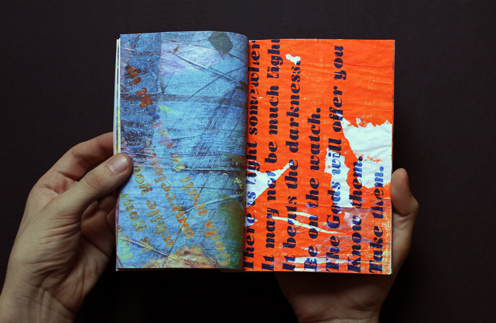
Above are a selection of pictures/pages from one of my earlier screen printing projects. 

A one-off edition of two screen printed and hand-bound books based around the poem 'The Laughing Heart' by Charles Bukowski. The larger format book is a black and white photocopied version of the smaller, full colour version. Bound using Japanese stab binding with french folded pages allowing each spread to be visually connected to the next whilst not letting the text be read in it's normal orientation or natural flow.

I chose this poem because of it's feature in a short video animation my friend and fellow student at Chelsea Bradley Bell made as part of our after effects project last year. To me it is near perfect, I will never forget watching it for the first time and the effect it has had on me since.  I've realised pretty recently that you should post about other people's work just as much as your own and that recognising/praising great design is not quite practiced enough. Below is said video, watch it and appreciate every single goddamn thing about it.  


Acetone for the Painfully Alone


Pictured above is the book that I made for my Bookbinding class midterm titled

 'Lost in Translation'.

The only guidelines we were given by our tutor Nancy was that the content of the book had to be autobiographical, we had to use a binding we had covered in the first half of the semester and that we were not allowed to use any text whatsoever (for fear of writing our life story from birth). 

I however ignored one of these instructions and instead decided to use text and only text in recording some of the problems I've had with using more than a few words since arriving in America just over two and a half months ago. On the left of each spread is an English word whilst on the right is the American word for the same object/thing/action. Some are well known to everyone (especially in the U.K.) however some you can only find out about whilst actually living here so I decided to document them in this book.

The book is a soft cover, multi-signature book constructed using 150gm Canford stock and hand printed using Acetone and photocopies. 

Five Leaves Left - Finyl Vinyl


As per usual it's been quite some time since my last post on this blog and I now have quite a bit of work backlogged to begin to blogging over the next week or so. To that end here is one of my final projects from the end of 1st year at Chelsea. For anyone who isn't aware I am just over one month into a four month exchange programme at F.I.T. in New York. Blogging stuff has been the last thing on my mind (until homework day comes round) hence it's taken this long for me to get round to it.

Above is my redesign of Nick Drake's Five Leaves Left vinyl cover worked on as a collaboration with our guest tutor Peter Chadwick of Popular studio. Looking back at how I approached this project I suffered with my normal method of approaching a project and even regressed back to a high school style of being afraid of our teacher as I hadn't done the work certain weeks, didn't see him and therefore lost out. Lesson learnt.

Tax On Oh Me


Last Wednesday the entire class spent a entire day in the Graphics Studio with Nigel & Pete who organised something of a one day print workshop for us.
We were each told to bring in one mechanical or electrical item that that had once served a purpose in our lives and that we no longer needed. We then were told to take them apart into as many pieces we could manage and arrange them  by size, shape, colour, material etc. Above are is my super old digital camera pre disassembly and my final taxonomy piece from the workshop. After arranging all of our pieces very neatly and photographing then we were told to ink up and print as many of the pieces as possible in a printed taxonomy. Things quickly got messy, photos below...


Five Leaves Left


So bar our film brief we only have one other ongoing project this term. We have been given a brief by Peter Chadwick, a pretty famous "graphic designer" to redesign a 12 inch vinyl sleeve of our choice. I chose Five Leaves Left by Nick Drake as it is one of my favourite albums but with probably one of the worst designed covers I have ever seen. Everything about it is shameful, especially the kerning of the title. Shudder. Going to try and have as much fun with this project as possible. See as vinyl is such a physical format I want to try and reflect that in my process so there will be a lot of drawing and printing going on over the next few weeks. Working with a square is not something we do a lot nowadays as well so I am really going to try and take advantage of this fact, how I'm not quite sure though. Hopefully development will be being posted up pretty soon.

Zoetrope pt.2


Okay so here's another update on my layered zoetrope project. I am still waiting on the video to be finalised and stuff so that'll have to wait till the next time I post about this which probably won't happen till it gets all signed off.

This in short is this is basically a run through for when I present my work to my class and my tutors. Nigel has a saying that if you tell an a difficult idea/concept 10 times to 10 different people that you slowly get better at it, so that's what I'm trying here.

Above are a couple of photos of my final zoetrope and the equipment I used inside my GLAMOROUS studio (Ben's room, thanks for that) to shoot the video. As I explained in my first post my original idea was to create a triple layered zoetrope where the first layer would be a cutout shape, second a printed acetate sheet and third a printed card sheet.

I started by designing the base for my zoetrope, initially trying to work out how to have three circles, all on the same level and all spinning at the same speed. After a lot of head scratching I came up with the neat idea of a tiered base which meant I could place it onto a record player and use that for my rotation. After designing I got it all laser cut, basically to try and minimise any error I might make if I tried to make 3 perfect circles by hand in the workshop. Last minute I changed my mind about materials, choosing corrugated card instead of mdf as I was worried about weight and the spinning power of the record player.
Also got my first layers laser cut, again for the same reason. Bought some acetate and got my third layer printed. 

Sadly after a lot of long afternoons and quite a lot of frustration I still haven't got anywhere near having 3 animating layers that remotely look like they have anything to do with eachother. In the end I think I was a little ambitious trying to get one layer to work was hard enough, let alone three working all together.

HOWEVER, all is not lost...

I started thinking about playing around with layers still, but instead of animating them having something else going on instead. Light is such a versatile medium I wanted to try and incorporate it into this piece. I bought a piece of frosted plastic from paperchase and dug out my industrial light, setup my tripod and started filming. I'm super happy with the final results which hopefully you'll be able to see pretty soon (fingers crossed).

Even though the results are completely different to what I had initially imagined that was the whole point of this project. The direction I took this project in has so much potential, hopefully I'll get the chance to explore it a whole lot more soon. The point of this project was to experiment, try something new, make something awesome looking even if it doesn't have a purpose. That's where I was a little different though but all will be revealed as soon as it's all done and dusted...


Copyright 2010. All rights reserved.

RSS Feed. This blog is proudly powered by Blogger and uses Modern Clix, a theme by Rodrigo Galindez. Modern Clix blogger template by Introblogger.