Showing posts with label 2D. Show all posts

Gentletude


It's been six months since my last post on this blog, so here's a quick post to remind myself that it's good to do this kind of thing more often than not. A lot has happened since, probably too much to write about in full, interesting detail so we'll start with my latest piece of work.

A typographic kindness manifesto in response to 'Gentletude' - a competition brief that aims to promote gentle-ness and kindness using typography. A never ending gif that can be easily shared via e-mail, facebook, twitter, ffffound and any other website/social media you care to name.

Super simple, super colourful.


Melancholia


A couple of months ago me and my housemate Katrin went along to the Roxy bar and grill (where we had our film premiers last year) in London Bridge to watch 'Melancholia', a film by Lars Von Trier. I have always meant to post about it since but it has been at the back of my mind till the other week when I was talking to a friend about incredible movies to watch.

One of the most beautifully shot movies I have ever had the pleasure of watching it was also one of the most thought provoking and after it finished me and Katrin were talking about it's meaning and aesthetic until well after we got home. Odd, but then most of the best things are quite odd in themselves. Having watched the film and watching the trailer back now it's hard to work out but I cannot recommend watching this film enough. There are some many little amazing details that add up to make this film one of the best I've seen in a long time. Kirsten Dunst plays an amazing role, I feel like I could write an essay about the content and context of this film.

The Love Competition


Once again, as always it has been far too long since my last entry on this blog and once again for the usual reason of me being busier than ever with college work,internships and outside projects. Now however I am on my Easter break and am back in Norwich for a week of hanging out with family and friends whilst eating as much food as I humanly can.

So over the next week I'm aiming to blog a little bit more about what I've been up to lately inspired by this film I stumbled upon last night which is rather wonderful. I won't explain the premise of the film (it should be obvious from the title) but have a watch and maybe it'll inspire you to reflect on love as you have experienced it in whatever form and from whatever source.


Eightfold


So tonight is the launch of our publications at the Eightfold exhibition at the Russian Club in Dalston, Kingsland Road. It is the official launch of Timbuktu magazine which I am happy to say is being collected from the printers this afternoon with some serious hype behind it. I have spent the last 2 weeks frantically sorting everything out for the first issue and am immensely proud of what we have achieved with this publication. It'll be great to see the final product, printed and bound, with our very special front covers as well which should make it even more awesome. ANYWAY. If you happen to read this before this evening and you didn't already know about it then please come down for an evening of beers and freshly printed publications. The exhibition is from 6-9pm only so get down early! Pictures of our finished publication will be up soon.


Location Location Publication

This is a bit of a nothing post really, just a bit of an update on everything that's been going on I guess over the past few weeks. 

The deadline has passed for submissions to Timbuktu and we ended up with over 40 pieces of writing which was a little unexpected and very overwhelming. We've read through all of them now and have whittled them down to 14/15 pieces we really like and think work well as a group. Getting started now on the layout and design of the actual book which I'll be taking control of mainly and letting everyone else get on with the image making process for the inside images.

Above is a photo of me standing in Wendover woods, the location for one of our photo shoots which we will be using for the publication. We were there for a whole day this week scouting locations and walking around in the mist. Won't give too much away right now but it's an amazing place and one I'd like to go back to in my free time and not for work. 

Production wise have lined up some super exciting finishes for our cover and inside pages which I can't wait to get all together into the final printed book. Our deadline is the 15th of this month. Ah. 

Timbuktu Magazine


Above is the mission statement myself and Mia came up with as part of the brief for one of our second term projects titled 'Territories'. We had to use the title as a starting point for the concept of a publication that we had to then present to the rest of our year group and persuade them that ours was the best. In short we were one of the eight successful groups chosen and are now going on to work on our publication along with four of our classmates who voted for us.

Really genuinely excited about this project and what it could entail for us within the next month or so and indeed the future. At the moment there's a lot of emails flying about trying to get this whole process started and trying to get submissions in. If you have any interest in creative writing at all, or know of anyone who does please click on the image above to download a printable PDF version of the brief with everything you need to know about what we're asking for.

Alternatively click HERE to get a PDF of the mission statement and brief.

Alternatively contact me via email (button above) to get a copy of the brief or just to ask any questions you may have about what we're doing. Below are the alternate media we'll be using to get in contact with people and get our brief out into the world.

Facebook: http://www.facebook.com/groups/167058120074138/
Tumblr: http://timbuktumagazine.tumblr.com/
Twitter: https://twitter.com/#!/Timbuktu_Mag

It's Been a While


It's been a while since my last post. Since then I have returned from my four months in New York, have moved back to my house in London and am now back on my course at Chelsea. I'm super excited about some of the work we've been doing already but won't have much to show for it until next week when hopefully I can post a bit more about what's happening with pictures.

Above are pictures of this awesome postcard I bought in N.Y. which changes its message depending on the angle you look at it. Positioned it so that when I'm sat at my (new and most amazing ever) desk on my laptop it says YES but anywhere else in the room it says NO. 

Good, forceful inspiration I think you'll agree.

Redesign The Bible


A quick post about a new brief we have just been given in advanced typography. Essentially our end of semester project we have been given the task of designing at least two book jackets for the world's all time best seller, The Bible.

We can split the text itself into as many books as we want with the obvious choice being the New and Old Testament as separate books which is the option I am leaning towards at the moment. However I still need to have a good sit down and think about this project. We've been given free reign with format sizing, imagery and typography so I really want to go as far as I can with this.

Above is Chip Kidd's front cover design for The New Testament, translated by Richmond Lattimore and commissioned by Farrar, Straus and Giroux publishing house. Here's what he has to say about it...

“If I am remembered for one jacket I would pick this one. I really have to hand it to the publisher for having the balls to go with it, and thus getting screwed by the major chains who refused to carry it. I’d also like to thank the photographer for allowing me to use this image in this context.” — Chip Kidd 

The image used is a photograph by artist Andres Serrano, of the face of a man, eyes half closed who had just been involved in a fatal car accident. It's use is a fantastic example of how simple imagery and type can be combined to create amazing pieces. Obviously eluding to the crucifixion, the climax of the New Testament it is full of bare emotion and meaning. I especially like the elongated cross used as a divider between the title and translators name.

However we have the opportunity to work with both old and new testaments, or each gospel as their own. We have the chance to create something really special which I what I am to try and do and hopefully not fall into the pit of literality whilst doing it. Updates soon.

Beyonce Knowles


This is my 100th post on this blog, one I've become very attached to and in the future hope to keep up a lot more regularly than I have been at any point during it's relatively short life.

Above is something silly in honour of this post, if you recognise the song then good for you and if (as a graphic designer) you know what I'm talking about then even better. Came up with this whilst in a lesson with Eli and have been wanting to make something of it ever since so I'm glad I finally found a use for it.

Zoo York


So if anyone who reads this blog of mine hasn't heard already, I am three quarters of the way through a four month semester studying at the Fashion Institute of Technology in New York. To document my stay I have a photo blog which can be accessed by clicking HERE just finished a mass upload basically covering the last few weeks including thanksgiving which I spent at my awesome friend Liz's (pictured above) in Long Island. Much more to come in the last few weeks of my stay, so sad to think about leaving right now but sort of excited to be going back to Norwich for Christmas and then London in the new year.

Hopefully going to get the chance to blog some more work in the coming week once I get my stuff together.

The Laughing Heart


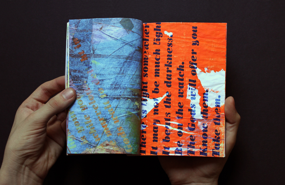
Above are a selection of pictures/pages from one of my earlier screen printing projects. 

A one-off edition of two screen printed and hand-bound books based around the poem 'The Laughing Heart' by Charles Bukowski. The larger format book is a black and white photocopied version of the smaller, full colour version. Bound using Japanese stab binding with french folded pages allowing each spread to be visually connected to the next whilst not letting the text be read in it's normal orientation or natural flow.

I chose this poem because of it's feature in a short video animation my friend and fellow student at Chelsea Bradley Bell made as part of our after effects project last year. To me it is near perfect, I will never forget watching it for the first time and the effect it has had on me since.  I've realised pretty recently that you should post about other people's work just as much as your own and that recognising/praising great design is not quite practiced enough. Below is said video, watch it and appreciate every single goddamn thing about it.  


Type Truck


A few weeks ago Me, Miriam, Jules and Alice took the Subway to Brooklyn to go to Fort Greene Flea Market where, outside the market was parked a van with a whole letterpress inside. The van and letterpress are part of the Type Truck project and are the brainchild of Kyle Durrie, a letterpress printer from Portland, Oregon. Using the  Kickstarter website to raise almost $18,000 towards the project she bought a 1982 Chevy step van and converted it into a fully functional letterpress print shop and is now traveling around the US teaching printing and selling her work. We each had a go printing as she told us about her travels. This is such a fantastic idea, I am beginning to wonder if it would be possible to do the same thing in the U.K. bringing letterpress to the masses. Pictures to come of the poster as soon as I retrieve it from Jule's room. Last picture of the Type Truck courtesy of Julia Salotti herself. Please take a few seconds to check out the link below and follow Kyle's amazing journey through the U.S!


1 Hour Business Card


Self initiated brief to design, print and cut a business card for myself for an upcoming networking opportunity later this week.

Designed on Photoshop and Illustrator, printed using photocopies and acetone onto Canford 'Ice White' 150gsm stock.


Beyond This Place


Having seen 'Fever Year' last month at the New York Film Festival, I had the opportunity to go see another new independent film with a quite incredible musical connection this weekend at BAM (Brooklyn Academy of Music).

'Beyond This Place' is a film about a 30 something year old Kaleo trying to reconnect with his father Cloud Rock La Belle who has been absent from his life since he was born, only keeping in contact via irregular letters and few and meetings few and far between. Cloud Rock's absence has been due to his lifestyle of Psychedelic drugs and absolute freedom which for him are almost religious beliefs.

Together the pair undergo a 500 mile bike tour across the Pacific Northwest. Documented by Kaleo (who himself is a film maker), the film is an exploration of what fatherhood really means to him, to Cloud and to the viewer. A new father himself, Kaleo's questions to his father are simple and to the point, full of emotion and resentment.

Though the film (and Cloud Rock) doesn't give answers, there is no final coming together of father and son, there is more of an understanding of each person and their standpoint. Why people choose to live like they do and the affects that it can have on others.

The musical link in the film comes from the magnificent Sufjan Stevens (along with Rayond Byron Magic Raposa of the Castanets) who scored the film at the request of Kaleo who is a childhood friend of his. Sufjan and Raymond were sitting onstage as the film was shown, playing their score live along with the film and spoken audio. This double performance was amazing to witness although it took me ten minutes to stop watching the musicians play and concentrate on the film itself. Two incredibly talented men, childhood friends, bought together by their creativity was just great to watch with the music only adding to the film it was a very clear collaboration. Again as with 'Fever Year' there was a Q&A afterwards which was fascinating especially on Kaleo's film making practice with this film and his now dorment again relationship with his father.

Four Eyes Colourblind Prints


Above and below are a couple of shots of my first 3 colour separation screen prints based on the self portrait photograph I posted a couple of weeks ago. Screen printing is something that I've never had the opportunity to try before until now and it's one of those things that always seemed weirdly magical as I never had any idea how the process worked. 

Now however, after more than a good number of weeks colour mixing, test prints, taping, reprinting and endless experimentation I am finally getting comfortable with how it works. Being able to hold a sheet that only you yourself have printed, from creating the artwork, shooting the screen, mixing the ink and pulling the print is really amazing.


Four Eyes


First in a selection of self portrait images for a screen printing project I'm working on. Way more work to come on this blog from all of my classes when I get the time to upload it. 

For now stay tuned.

Five Leaves Left - Finyl Vinyl


As per usual it's been quite some time since my last post on this blog and I now have quite a bit of work backlogged to begin to blogging over the next week or so. To that end here is one of my final projects from the end of 1st year at Chelsea. For anyone who isn't aware I am just over one month into a four month exchange programme at F.I.T. in New York. Blogging stuff has been the last thing on my mind (until homework day comes round) hence it's taken this long for me to get round to it.

Above is my redesign of Nick Drake's Five Leaves Left vinyl cover worked on as a collaboration with our guest tutor Peter Chadwick of Popular studio. Looking back at how I approached this project I suffered with my normal method of approaching a project and even regressed back to a high school style of being afraid of our teacher as I hadn't done the work certain weeks, didn't see him and therefore lost out. Lesson learnt.

The Dancing Printer


I think I got that thing you get when you are at home for too long and get so ridiculously bored that even the smallest, most pointless thing will entertain you for a few long hours. Having said that here's a short film I made of my printer whilst at home in Norwich last week after noticing that whenever you print something it does a little (happy?) dance. It amused me so hopefully it'll amuse some of you.

Back in London now so slightly less cabin-fever-ish...

Loads more stuff to come soon hopefully as and when I get some free moments

Film Poster


Movie poster for our film 'Golden Foam' will be collated with the 9 other groups posters and be printed as one long reel. Photos to come of when that happens and stuff. Oscar night is almost upon us, hopefully there will be some photos of that too appearing at some point after Thursday!

Lights, Camera, ZZzzZzzzzz


Started shooting our film 'Golden Foam' on Friday, here's one of the first stills which we shot in Luke's house. Shooting now on Tuesday and Thursday with final hand in on Monday.
 

Copyright 2010. All rights reserved.

RSS Feed. This blog is proudly powered by Blogger and uses Modern Clix, a theme by Rodrigo Galindez. Modern Clix blogger template by Introblogger.